PicturePager uses templates as a basis for the output web pages. One of the dictionary definitions of template is:
That's all we mean here. The template serves as a pattern for the output web pages. The same inputs (photos and text) can be rendered quite differently depending on which template is chosen on the Settings tab.
The user selects a template from the Image Settings screen, using the Template for Layout entries. Template files end with the .ppg extension, but are basically just HTML files with some additional codes in them. By selecting a different template, the user can change the look dramatically.
PicturePager Version 2 introduces a more complex Template structure. While this makes creating new templates nominally more difficult, it presents the following advantages also.
The Template Chooser provides a friendly mechanism for previewing templates for the gallery. Each template includes a preview JPEG file, around 320 x 220 in size, and a text description that allow the user to quickly get a sense of the purpose and appearance of that template.
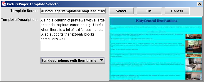
The graphic preview is static; that is, it does not reflect the photos selected on the Image Files tab. Instead it is meant to be representative of the effective layout.
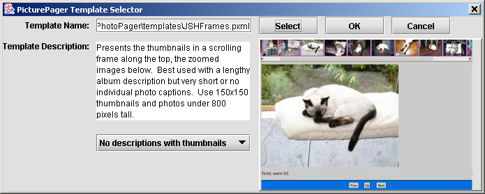
The user can select the size of the thumbnail text here also, between none, first 30 characters, or Full. This is neither checked nor enforced by the template, but because of the impact on the appearance, it is selected here.
For example, the next three screens are shots of the three templates on exactly the same data and thumbnail sizes, the only difference being the loaded template and that the LongDescriptions template was in 4x1 rather than 2x2 mode. (Keep in mind that you can change the output columns and rows from the Settings tab.)
These were limited to four images per page solely for ease-of-example here. Typical galleries have much more on each page. These screen shots have also had the colors reduced to 256 for faster loading; I'm assuming you don't care that much about the sample thumbnails. But all three shots were at precisely the same framesize; it's amazing how much better information may fit one template than another.
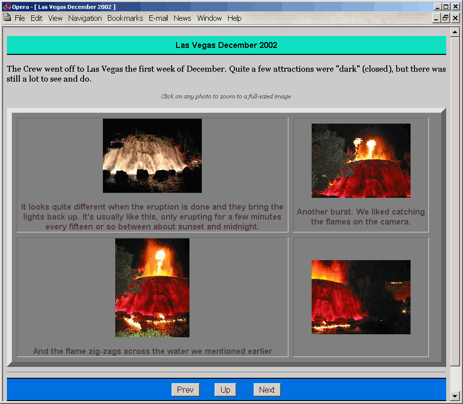
The above screenshot is using the JSButtons template. That stands for "Java Script Buttons"; this template is pretty simple, but uses JavaScript buttons for navigation. (The Previous and Next buttons are not displayed when on the first or last page respectively.)
JSButtons is particularly good for a classy, easy-to-navigate format in an album with lots of photos that have very little description each. The album can have quite a bit of description; that goes up top across the screen, which is easy to read and space-efficient.
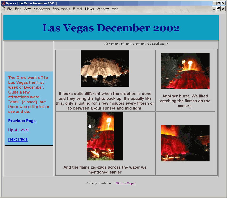
The Basic template has two main differences from JSButtons...
No JavaScript - navigation is via normal link (which again is omitted when appropriate)
Album Description on the left
Basic works well for smaller albums with a small album description and consistently-sized photo descriptions.
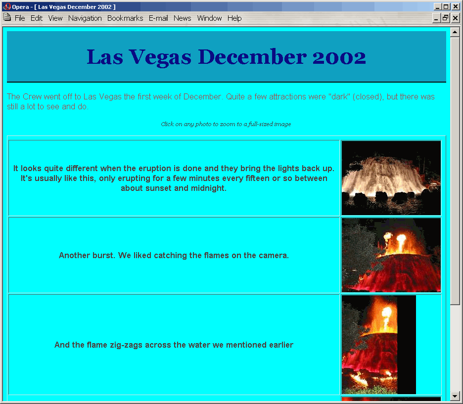
LongDescriptions is laid out differently and works best in an N-by-1 format as displayed here. It also isn't very good for lightly-commented pages; it's best for pages with heavy commenting, such as the story behind each photo.
LongDescriptions is the template of choice for most of my galleries, because I tend to be using the pictures to help tell the story. Photos of the Mirage Volcano would be accompanied by text detailing how it works, what's neat about it, who was there, and more. But most of my family is more visual and less detail-oriented; the text space is less important. For them I would suggest JSButtons if the album description is more than a paragraph and Basic otherwise, because they are friendlier appearing.
Users may choose to build HTML pages, here called secondary pages, for each photo. If Build HTML for Full-Sized Images is checked ("on"), the images are wrapped in a friendly web page. This is the preferred setting; the alternative if the user clicks to the image and must use their "back" function to return to the previous page.
When Build HTML is on, the same template is used for it unless an _zoom.ppg template is found. The problem is this: The zoom screen has no need for a grid for multiple photos and little need for a verbose album description; presumably the user knows where they came from. So in many cases the geometric layout for a zoom page should be dramatically different than the layout for the thumbnail page. This allows it to happen.
This is especially important for the template "LongDescriptions.ppg" due to the anticipated large comments beside it. So LongDescriptions.ppg comes with a companion sub-template, "LongDescriptions_zoom.ppg", which handles the zooms. As long as it can be found during the build, the _zoom.ppg template is used for zooms instead of the master template.
These are not strictly necessary. Note that the JSButtons template does not have a _zoom.ppg companion; this is because the only side-effect to not having a proper gride for JSButtons is a colored bar at the bottom.
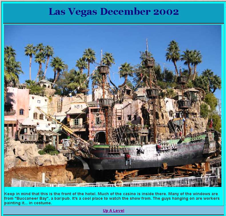
The screenshot above has been downsized and saved as a JPEG to provide faster downloading and a friendlier document format. If this had been real life it would have been a bit larger and the text much sharper. However, this was from the same Las Vegas series; it is an example of the LongDescriptions_zoom.ppg template output on the full-sized images with Build HTML turned on.
PicturePager templates are meant to be very easy to design and modify. Each template consists of between three and six files:
| Type | Extension | Purpose |
|---|---|---|
| Template master | .pxml | Describes the template, sets parameters, references other files |
| Graphic preview | .jpeg | Image preview (320 x 220 or so) of what it looks like. Referred to as PreviewName= in template master. |
| Template pattern | .ppg | Contains HTML and codes for processing Referred to as MainName= in template master. In frames, this is the equivalent of a zoom page; it is used for the larger image in the frame. |
| Frame Name | .ppg | (If the template is for a frame)Frame layout page, containing references to both frame sources and their sizes. Referred to as FrameName= in template master. |
| Start Frame | .ppg | (If the template is for a frame)The zoom area for a frame starts blank, because no photo is selected. This is the code to plug into that area initially. Typically it would include the album description. Referred to as FrameStart= in template master. |
| Zoom File | .ppg | Template pattern for the zoom page. If not provided and Build HTML is selected, the Template pattern file is used instead. |
These can seem a bit complex simply because there are so many pieces, but they're actually pretty simple. Rather than trying to build one from scratch, try copying and modifying the existing ones.
The Template Chooser will only list .pxml files, of which there is only one per template. This simplifies things for the novice user. Note that the .ppg files can be used by multiple templates.
There are really only a few enhancements from standard HTML:
| Code | Type | Meaning |
|---|---|---|
| PXML Template Description File Fields | ||
| MainName | PXML file | Name of the primary (thumbnail) template. Required. |
| FrameName | PXML file | Name of the Frame source template, if any |
| ZoomName | PXML file | Name of the Zoom template, if any |
| PreviewName | PXML file | Name of the 320x220 (max) JPEG image of a sample of this template. Optional. |
| Description | PXML file | Text describing the look and purpose of this template. |
| Template File Fields | ||
| rows | PXML file | Maximum or Constant rows for this template. |
| RowsVariable | PXML file | "true" if rows is a maximum, "false" if it is constant (e.g. only 1 row allowed.) |
| cols | PXML file | Maximum or Constant columnss for this template. |
| ColsVariable | PXML file | "true" if cols is a maximum, "false" if it is constant (e.g. only 1 column allowed.) |
| <!--%%TITLE%%--> | Stand-alone, Repeatable | Insert Album Title Here |
| <!--%%FRAMEINDEX%%--> | Stand-alone, Frame only | In Frame Source, inserts name of Frame thumbnail document. |
| <!--%%FRAMEDEST%%--> | Stand-alone, Frame only | In Frame Source, inserts name of Frame image document. Must include target="photo_destination" |
| <!--%%DESC%%--> | Stand-alone, Repeatable | Insert Album Description Here |
| <!--%%CELL%% | Start-tag, Unique | Begin the Thumbnail Cell here. |
| %%CELL%%--> | End-tag, Unique | End the Thumbnail Cell here. |
| %%IMGDESC%% | Inside Cell Tags, Unique | Insert Photo Description Here |
| %%THUMBIMG%% | Inside Cell Tags, Unique | Insert Thumbnail Image Here |
| <!--%%NAVPREV%% <!--%%NAVUP%% <!--%%NAVNEXT%% | Start-tag, repeatable | Begins the conditional for the Navigation Tag |
| %%NAVPREV%%--> %%NAVUP%%--> %%NAVNEXT%%--> | End-tag, repeatable | Ends the conditional for the Navigation Tag |
| %%PREV%% %%UP%% %%NEXT%% | Navigation-tag, repeatable | Inserts calculated URL for the Navigation Tag |
PicturePager builds the page of thumbnails by building a rows-by-columns table (except for single-row frames... see below). The template contains the beginning and ending table statements, but the actual cell-tags are handled by PicturePager, so that it can adjust them if the user wants a different number of rows or columns or both.
This creates several issues:
Single-Row Frames: Frames are a very special case for templates. They require two additional source files, one for the frameset document and one for the initial target page (which typically contains the album title and description.) But horizontal frames must place all the images side-by-side, which presents a problem given PicturePager's default of placing each thumbnail in a separate tab row. Consequently a separate case is used for situations where a frame is defined (by the template) and there is a single row; in these cases, a table is still created so that borders may optionally be used, but the data is all in a single table row. Also don't forget when creating a horizontal template that paragraph formatting should be around the entire cell structure rather than with-in, to avoid pushing images down a line.
Formatting the image description data
Placing the image in a different table cell than the description
Both of these are easily handled, though perhaps not entirely intuitive, and both are done in the LongDescriptions.ppg template. The
trick is in the cell begin and end tags, <!--%%CELL%% and %%CELL%%-->. Everything inside these
tags is repeated for each image; the cellular wrapping occurs around the entire cell-data defined by these. The image name and description are
plugged into the macros inside the cell-data.
To separate the image from the description via table cell, you can insert the
</td><td> between the two tags inside the cell tags. This is
what LongDescriptions.ppg does...
<table border="1"  align="center">
<!-- The above is the mandatory cell-wrapping table -->

<tr><td><!--%%CELL%%
 <P class="Desc">%%IMGDESC%%</p> </td><td>%%THUMBIMG%%
%%/CELL%%--></td
></tr>

<!-- Now close off the mandatory cell-wrapping table -->

</table>
The above also demonstrates how to format the descriptive text, specifically with this line:
<P class="Desc">%%IMGDESC%%</p> </td><td>%%THUMBIMG%%
Any formatting codes can occur there; these templates use CSS to make them easier to modify. At the top of LongDescriptions.ppg is the line:
<STYLE TYPE="text/css"> p.Desc
{ font-weight: bold; color: rgb(80,60,60); font-family: sans-serif;}
</STYLE>
Of course you could simply create a style for the default paragraph, but given the different purposes (album title, album description, image title, image description, navigation bar), this is a bit cleaner.
Gallery pages are linked together with navigation tags; these are calculated on-the-fly to create links to the previous and next gallery pages and, when applicable, up in the gallery. Navigation tags are conditional, meaning that when tag isn't needed, it doesn't appear. For example, the Previous tag will not appear on the first page of a gallery, the Next tag will not appear on the last page of the gallery, and the Up tag will only appear at the top level if a Home URL is specified in the Settings tab of the PicturePager GUI.
Unlike the cell tags, navigation tags may occur in several places in a template. This allows the placement of navigation bars at both the top and bottom of the page simultaneously.
The following is the code from Basic.ppg.
<DIV CLASS="navbar">

<table cellpadding="4" cellspacing="10"><tr><td><p class="new"><!--%%DESC%%--></p></td></tr>

<!--%%NAVPREV%% <tr><td><a href="%%PREV%%">Previous Page</a> </td></tr> %%NAVPREV%%-->

<!--%%NAVUP%%   <tr><td><a href="%%UP%%">Up A Level</a> </td></tr> %%NAVUP%%-->

<!--%%NAVNEXT%% <tr><td><a href="%%NEXT%%">Next Page</a></TD></TR> %%NAVNEXT%%-->

</TABLE></DIV>
As with the Thumbnail Cells, this uses CSS to format some of the text. The table is not mandatory; it's merely used as a convenience here. The JSButtons.ppg
template does not wrap the navigation inside a table. But note that the actual table cell elements (<tr><td> ... </TD></TR>)
occur inside the navigation start-end tag pairs; this results in that entire table cell only being created when it will have some valid contents.
Not too many photos per page! Use a reasonably number of photos per page. Certainly don't go above four columns; people hate scrolling sideways. Scrolling down is easier, but most (not all) still prefer to hit Next rather than scrolling down a long screen. It's friendlier, it breaks the gallery into managable chunks. And it doesn't cost you anything.
Put enough photos per page Anything less than about four photos per page will just annoy most users, especially if they then go on to zoom most of them. In an album with light commenting, eight to ten is probably a good sweet spot, using smaller thumbnails if necessary. In an album with lots of comments for most photos, consider four per page, larger thumbnails, and using the LongDescriptions template.
Frames only support a single index (thumbnail) page, so set either rows or cols large enough that a user would never exceed it.